

Four weeks into the Iran war, the market is sending a signal that most investors are misreading. On the surface, Fed liquidity is expanding. Global M2 is growing. By the standard playbook, this should be a risk-on environment.
It is not.
The sector data tells a completely different story: a broad de-risking pattern where Energy is the only sector in the green, and even traditionally defensive plays like Utilities and Consumer Staples are deep in the red. This is not rotation. This is capital leaving the building.
Let me walk you through the numbers, explain why this matters, and lay out what to watch over the next four to six weeks.
The Liquidity Snapshot
Every week, the Fed publishes data that lets us calculate what I call Net Fed Liquidity, or NFL. It is a simple formula:
NFL = Fed Balance Sheet (WALCL) minus Treasury General Account (TGA) minus Reverse Repo (RRP)
Think of it this way: the Fed’s balance sheet is the total pool of money the central bank has injected into the system. But not all of that money is actually circulating. The Treasury keeps a cash account at the Fed (the TGA), and financial institutions can park money overnight at the Fed through the reverse repo facility (RRP). Subtract those two drains and you get a rough measure of how much liquidity is actually available to flow into markets.
Here is where we stand as of March 27:
Fed Balance Sheet (WALCL): $6.657 trillion, up $43 billion from a month ago. Here is what is actually happening: in December 2025, the Fed formally ended its quantitative tightening program and began buying short-term Treasury bills to keep enough cash in the banking system. It is calling this “reserve management” rather than quantitative easing, and the distinction matters, this is not stimulus, it is plumbing. The Fed is not trying to push rates lower or boost asset prices. It is simply making sure banks do not run short of reserves. The practical effect is that the balance sheet is no longer shrinking, and the direction of net liquidity now depends almost entirely on what the Treasury and the reverse repo facility are doing.
Treasury General Account (TGA): $874 billion. This one is interesting. In early March, the TGA dropped sharply from $913 billion to $832 billion. When the Treasury spends down its cash balance, that money flows into the economy, which acts as a hidden liquidity injection. That $81 billion drop was a tailwind for markets. But since March 4, the TGA has been climbing back up, rising $42 billion in three weeks. A rising TGA acts as a hidden drain, pulling liquidity out of the system even when the Fed’s balance sheet is growing.
Reverse Repo (RRP): $0.9 billion. Essentially zero. This facility used to hold over $2 trillion. Its collapse to near zero means this source of liquidity injection is completely exhausted. There is no more fuel in this tank.
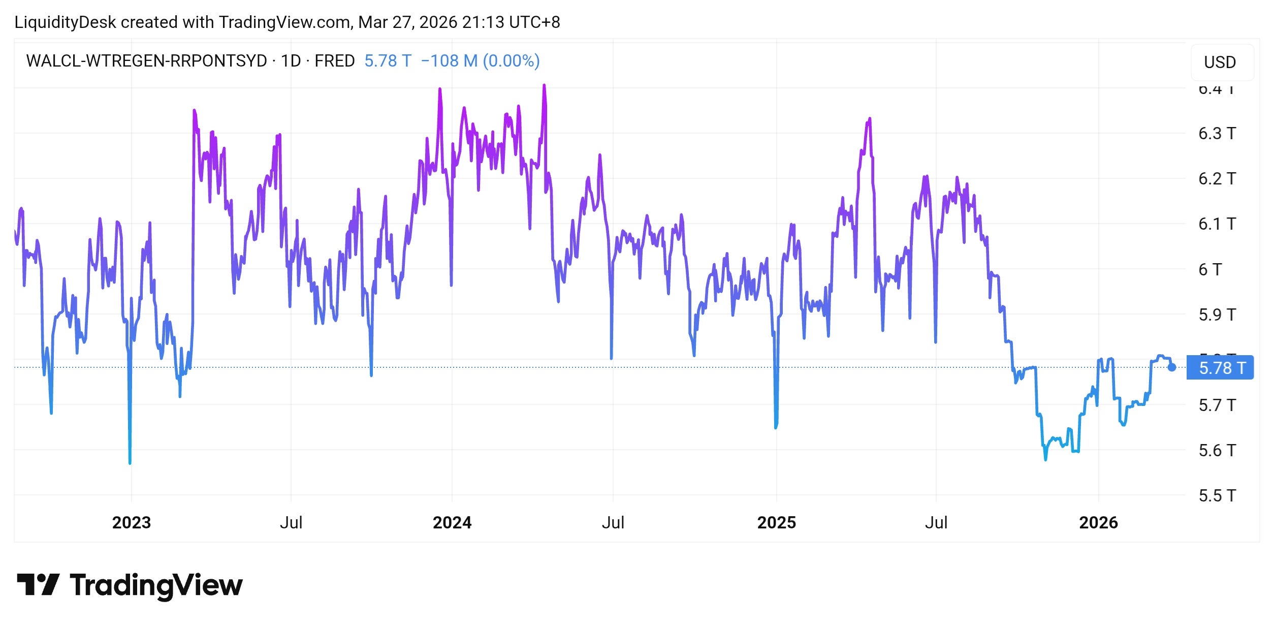
Net Fed Liquidity: $5.782 trillion.
The month-over-month change is +$57 billion, which clears our significance threshold of $50 billion. In a normal environment, this would be a clear risk-on signal.
But we are not in a normal environment.
Why the Headline Number Is Misleading
Three problems with taking the NFL reading at face value:
First, the direction of the TGA has flipped. The early-March liquidity boost came from the Treasury spending down its account. That is now reversing. If the TGA keeps rising through April, as it typically does around tax season, the next NFL reading could easily swing negative. The $57 billion gain we see today is largely a residual from the first week of March, not a signal of ongoing expansion.
Second, the RRP is tapped out. For the past two years, the gradual decline of the reverse repo facility has been a steady source of liquidity flowing back into the market. With RRP now at effectively zero, that tailwind is gone. Any future liquidity expansion has to come directly from the Fed’s balance sheet or from TGA drawdowns, both of which are harder to sustain without an explicit policy decision.
Third, the cycle peak was $7.137 trillion back in September 2021. Current NFL is still $1.355 trillion, or 19%, below that level. Even with the monthly increase, we are operating in a structurally tighter environment than most of the post-COVID period.
The bottom line: liquidity is slightly positive on a one-month basis, but the quality of that signal is low and deteriorating.
Global Liquidity: Growing, but Not for the Right Reasons
Zooming out to the global picture, total M2 money supply across the four major central banks (Fed, ECB, BOJ, PBOC) stands at approximately $99.7 trillion as of March 25.
Over the three months through January, dollar-denominated global M2 grew by 4.1%, which sounds healthy. But dig into the components and the story is less encouraging.
A significant chunk of that three-month growth came from the dollar weakening by about 2.8% through January. When the dollar falls, foreign M2 measured in dollars looks bigger, even if nothing actually changed in local terms. Strip out the currency effect and the real growth rate drops to about 2.4%, which is above average but far from a liquidity boom. Since then, the picture has flipped: the dollar has strengthened roughly 2.4% over the past month, driven by safe-haven demand from the Iran conflict and the Fed’s hawkish pivot on March 18. A stronger dollar now works in the opposite direction, compressing global M2 in dollar terms. The currency tailwind that inflated the headline number is gone.
Looking at the individual central banks:
The ECB is still shrinking its balance sheet. The Eurosystem’s total assets fell to €6.155 trillion as of March 20, down €13 billion in a single week and €128 billion over the full year 2025. At its March 19 meeting, the ECB kept its deposit rate unchanged at 2.0%, the sixth consecutive hold, citing the Iran conflict as a near-term inflation risk and revising its 2026 inflation projections upward. Deutsche Bank’s base case is for rates to stay at 2% through 2026, with the next move a hike in mid-2027. The ECB is simultaneously shrinking its balance sheet and holding rates at restrictive levels — a double drag on European liquidity that reinforces the global picture.
The Bank of Japan is also in QT mode. Total assets have dropped to ¥677.8 trillion, the lowest since Q2 2020, down ¥78.6 trillion from the peak in Q1 2024. The BOJ has been reducing its government bond holdings at an accelerating pace. One nuance worth noting: from April 2026, the BOJ plans to slow the pace of its JGB runoff, cutting the quarterly reduction from ¥400 billion to ¥200 billion. QT continues, but at a more measured tempo going forward.
China’s PBOC is the one major central bank actually easing. Chinese M2 reached 349 trillion yuan in February, and the PBOC has been cutting reserve requirements and lowering rates. As recently as March 22, Governor Pan Gongsheng reaffirmed a “moderately loose” policy stance for 2026. That said, bond markets are already pricing in less additional easing than before, with 30-year Chinese government bond yields hitting an 18-month high this week. China is still the only major central bank in easing mode, but the easy part of that trade may already be in the price. China’s easing is also domestically focused and has limited spillover to global risk assets.
The US M2 reached $22.67 trillion through February, growing at a modest pace.
The takeaway: global liquidity is growing in dollar terms, but most of that growth is a currency illusion. The ECB and BOJ are actively draining, the Fed is in an ambiguous zone, and only China is genuinely easing. This does not confirm the US NFL signal.
The Sector Rotation Matrix: A De-Risking Signal
Now here is where the analysis gets interesting. I track the 11 S&P 500 sector ETFs across three timeframes: one month, three months, and six months. The picture right now is one of the clearest I have seen.
One-month performance:
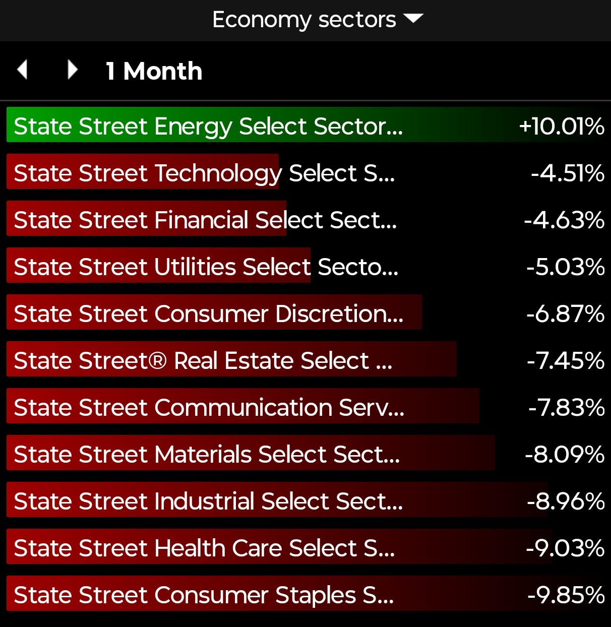
Energy is the only sector in positive territory, up 10%. Every other sector is red. Technology is down 4.5%, Financials down 4.6%, Utilities down 5%, Consumer Discretionary down 6.9%, Real Estate down 7.5%, Communication Services down 7.8%, Materials down 8.1%, Industrials down 9%, Health Care down 9%, and Consumer Staples down 9.9%.
This is not normal sector rotation. In a typical rotation, you see money moving from one group to another. Growth sells off while value picks up, or cyclicals weaken while defensives strengthen. What we have here is different: everything is falling except the one sector directly tied to the geopolitical crisis.
When Utilities (a classic safe haven) and Consumer Staples (another defensive play) are both down nearly 5 to 10 percent in a single month, that is not rotation. That is capital exiting the equity market entirely.
Three-month performance tells the same story with more nuance:
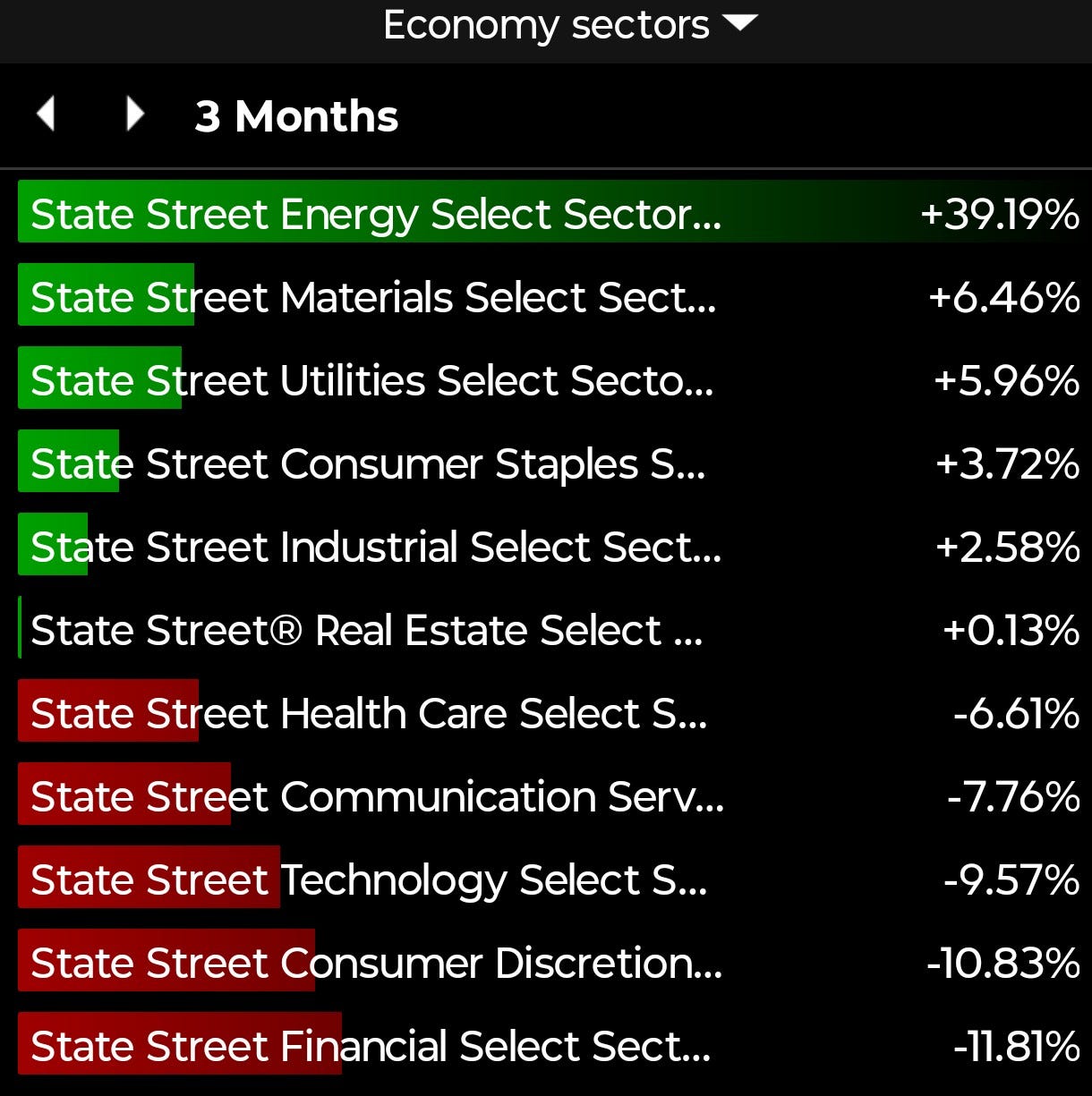
Energy dominates at +39%. Behind it, a handful of defensive and commodity-linked sectors are positive: Materials at +6.5%, Utilities at +6%, Consumer Staples at +3.7%, Industrials at +2.6%. Real Estate is barely positive at +0.1%. Then the growth and cyclical sectors crater: Health Care is down 6.6%, Communication Services down 7.8%, Technology down 9.6%, Consumer Discretionary down 10.8%, and Financials down 11.8%.
Over three months, a barbell has formed: Energy and commodity-linked sectors on one side, and everything else getting sold. The defensive sectors that are positive over three months are still losing money on a one-month basis, meaning even the barbell is breaking down.
Six-month performance confirms the trend is not new:
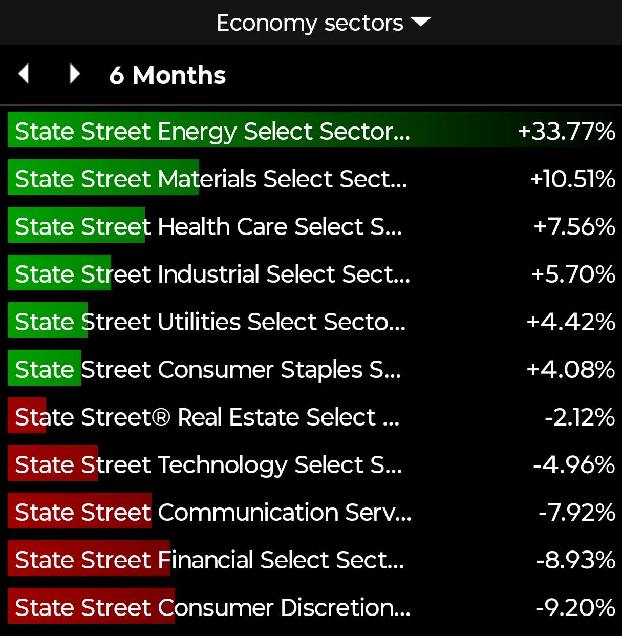
Energy at +33.8%, Materials at +10.5%, Health Care at +7.6%, Industrials at +5.7%, Utilities at +4.4%, Consumer Staples at +4.1%. Then: Real Estate at negative 2.1%, Technology at negative 5%, Communication Services at negative 7.9%, Financials at negative 8.9%, Consumer Discretionary at negative 9.2%.
The war amplified a rotation that was already underway. Energy has been the dominant sector for six months, not just since the conflict started. What changed in the past month is the severity: even the defensive sectors that were holding up are now getting pulled down.
The Cross-Asset Picture
The sector data does not exist in a vacuum. Here is what the rest of the market is telling us:
S&P 500 at 6,551. Down roughly 8% from the highs around 7,100. This is a meaningful correction but not yet a bear market. The key question is whether the selling stays orderly or accelerates.
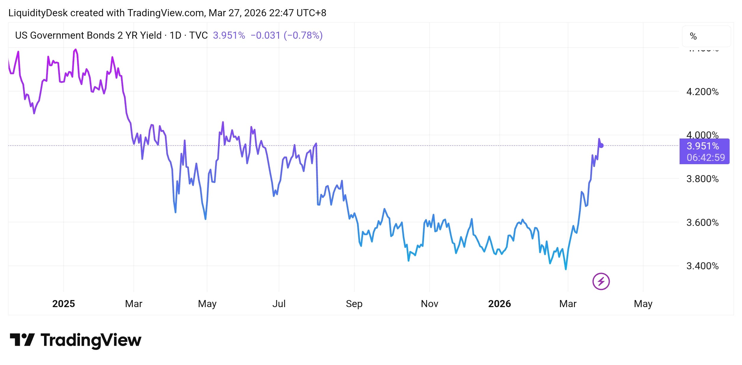
The 2-year Treasury yield has spiked to 3.99%. This is a sharp move higher from the 3.5% zone just a few weeks ago. The bond market is repricing Fed expectations. Before the war, traders were pricing in rate cuts. Now, with Brent above $100 and inflation likely to reaccelerate, the market is starting to question whether the Fed can cut at all this year.
The 10-year minus 2-year spread has compressed to 0.46%, down from 0.75%. A flattening curve in this context means the bond market sees a policy dilemma: the Fed may need to stay restrictive because of energy-driven inflation, even as the economy slows. That is the textbook setup for stagflation.
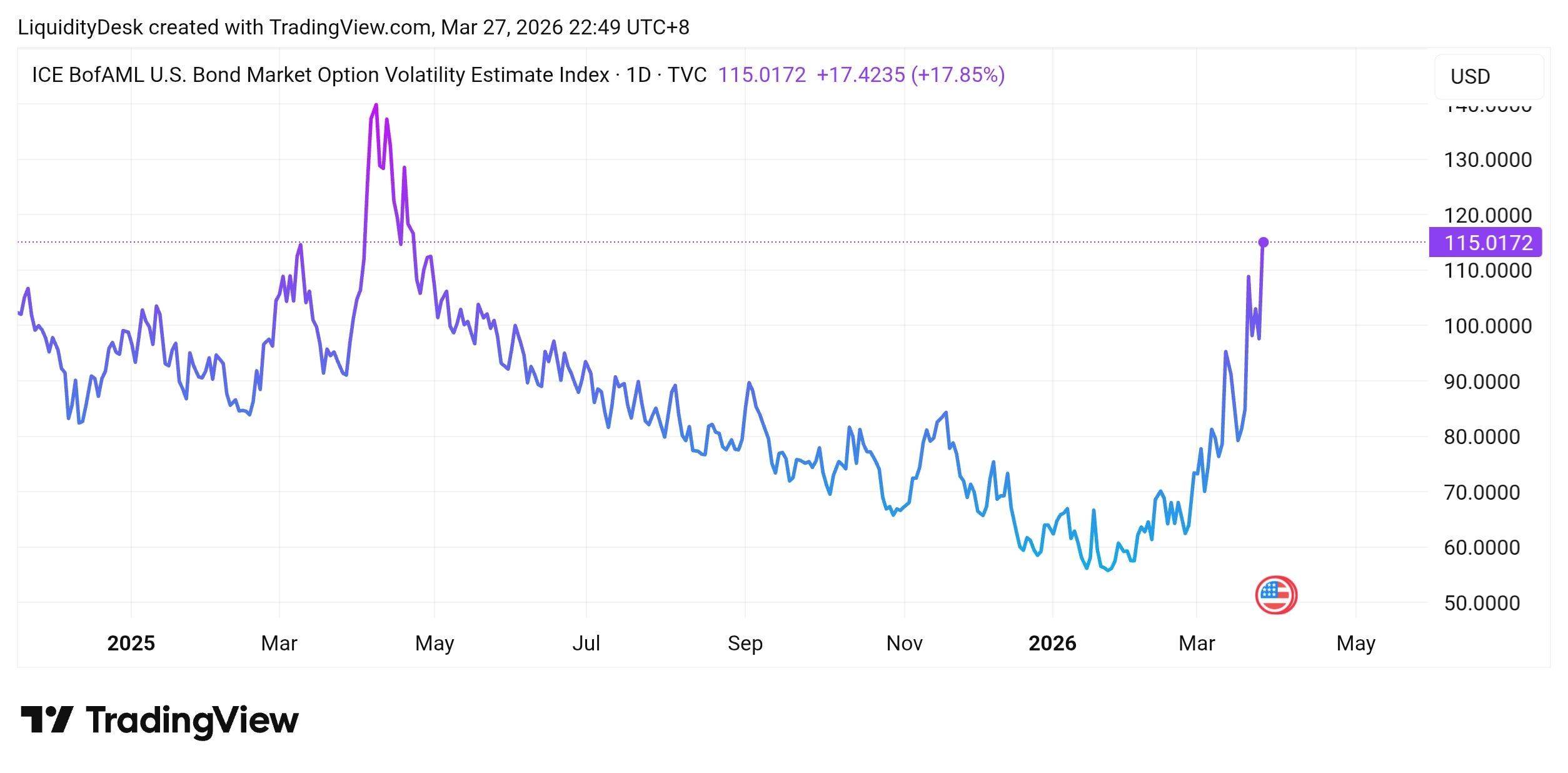
The MOVE index (bond volatility) is at 115. This is the signal I am watching most closely. Anything above 100 indicates stress in the bond market. At 115, bond volatility is telling us that the fixed-income market is genuinely uncertain about where rates and policy are going. When bond volatility is high, it tends to constrain risk-taking across all asset classes.
Credit spreads (HYG/LQD ratio) at 0.7316. This is actually the one constructive signal in the entire dashboard. Credit spreads have not blown out, which means the corporate bond market is not yet pricing in recession or widespread defaults. If this ratio starts dropping sharply, it would confirm a much more serious risk-off move.
The Inflation Complication
Before the war, inflation was behaving. February CPI came in at 2.4% year-over-year, unchanged from January and near the lowest level since mid-2025. Core CPI was at 2.5%. These were numbers that gave the Fed room to think about easing.
That window just closed.
Brent crude has surged more than 40% since the strikes began on February 28. As of this week, Brent is trading around $103 and WTI around $95. The Strait of Hormuz, which handles roughly 20% of global oil supply, remains effectively closed.
The March CPI print, due April 10, will be the first report to fully capture the energy price shock. Headline CPI could jump to 2.8% or higher, and if oil stays above $100, the April print could push past 3%.
Gold is trading around $4,430 today, down roughly 21% from its all-time high of $5,589 reached in January. The selloff reflects a straightforward repricing: the Fed’s hawkish pivot on March 18 pushed real yields sharply higher, the dollar strengthened, and markets moved from pricing three rate cuts at the start of the year to pricing none at all for 2026. Since gold pays no yield, rising real rates directly increase the cost of holding it and with the Fed now openly discussing rate hikes if inflation persists, the case for holding gold as a near-term trade has weakened. The longer-term thesis remains intact: geopolitical risk is not going away and confidence in fiat currencies continues to erode. But the easy part of the gold trade is behind us.
For the Fed, this creates an impossible dilemma. The economy is showing signs of slowing, equities down, hiring stumbling, but inflation is reaccelerating because of an external supply shock. The base case at the March 18 meeting was still one rate cut in 2026, but Powell was careful to qualify it: “The rate forecast is conditional on the performance of the economy, if we don’t see that progress, you won’t see the rate cut.” More tellingly, when asked about rate hikes, he declined to rule them out. “We are prepared to do what needs to be done,” he said. Rate hikes are not the base case. But the fact they are being discussed at all tells you everything about how the regime has shifted.
What This Means for Positioning
Let me bring all the signals together into a coherent framework.
The liquidity regime is nominally positive but deteriorating. NFL gained $57 billion month-over-month, but the TGA is reversing direction and RRP is exhausted. Global central banks outside the US are tightening. This is not an environment that supports aggressive risk-taking.
The sector signal is unambiguous: de-risking. Energy is the only trade that is working. On a three-month basis, a barbell of Energy plus defensives has formed, but even that barbell is showing cracks on the one-month timeframe. The broader message is that institutional capital is reducing equity exposure.
The bond market is flashing stress. MOVE above 100, the yield curve flattening, and 2-year yields spiking all point to a market that is repricing the macro outlook. Credit spreads are the one signal that has not confirmed the worst case yet.
The geopolitical risk is not going away. Iran rejected the US peace proposal this week. The Strait of Hormuz remains disrupted. Oil above $100 is the baseline, not the tail risk.
For investors thinking in the one to three month timeframe:
Energy remains the primary overweight. Every “peace hope” dip in energy stocks has been a buying opportunity, not an exit signal. The supply disruption is physical, not speculative, and it will persist until the Strait of Hormuz reopens, which is not imminent.
Reduce exposure to rate-sensitive growth. Technology, Communication Services, and Consumer Discretionary are the most vulnerable to rising yields and an inflation resurgence. The three-month and six-month trend is clearly against these sectors.
Watch credit spreads as your canary. If HYG/LQD starts breaking down from the 0.73 level, that would be the signal to get much more defensive. As long as credit holds, the selloff in equities is a repricing, not a crisis.
Gold has corrected sharply but remains a valid hedge. At around $4,430, the inflation hedge thesis has not disappeared, but the easy money was made earlier in the cycle. The risk/reward is more balanced now, and a further move higher in real yields could push it toward the $4,350 support level.
What to Watch Next
April 10: March CPI. This is the most important data point in the next two weeks. A reading above 2.8% would confirm the inflation re-acceleration thesis and likely push 2-year yields higher.
TGA direction. If the Treasury General Account keeps rising toward $900 billion or above, the hidden liquidity drain will offset any gains from the Fed’s balance sheet. This is the most underappreciated risk to the current NFL reading.
Strait of Hormuz shipping data. Daily transit volumes are the best real-time proxy for how long the oil supply disruption lasts. No normalization means no oil price relief means no Fed flexibility.
HYG/LQD ratio. Stable credit spreads are the last line of defense for the bull case. A break below 0.72 would be a serious warning signal.
The liquidity map technically says risk-on. Every other signal says be careful. When the numbers disagree, I trust the sector data and the bond market over a single monthly liquidity reading.
The war changed the regime. Make sure your portfolio reflects it.
This is the first issue of Liquidity Desk’s monthly deep dive on liquidity and sector rotation. Every last Friday of the month, this analysis captures the full picture, all the data that mattered, all the signals worth tracking. If you found it useful, subscribe to get it every month.
Nothing in this publication constitutes financial advice. All content is for informational and educational purposes only. Always do your own research and consult a qualified financial advisor before making any investment decisions.