

| Historical Series | May 2026
Picture this: September 2007. Your portfolio is growing. The S&P 500 is near an all-time high. The news talks about “some volatility” but analysts are reassuring, the economy is stable, unemployment is low, corporate earnings are solid. You buy. Everything seems logical.
Twelve months later, the S&P 500 is in freefall. Lehman Brothers, the fourth-largest investment bank in the world, files for bankruptcy on September 15, 2008. The market loses over 50% of its value. Millions of people watch their retirement savings evaporate.
But here is the question few people ask: could I have seen it? The information was there. Not hidden in classified reports or accessible only to insiders. Public. In real time. You just needed to know where to look, and more importantly, to look at everything simultaneously, not just equities.
The Single Indicator Lies to You
This is the fundamental mistake most investors make, and it is understandable. You follow the S&P 500 or Nasdaq, watch whether your portfolio is growing, and everything seems fine. But equities are often one of the last major markets to price systemic stress. The first signals come elsewhere.
When credit markets, bond traders, and the shape of the yield curve speak, they speak months before equities react. The problem is that these signals are more complex, less media-friendly, and require you to understand exactly what you are looking at.
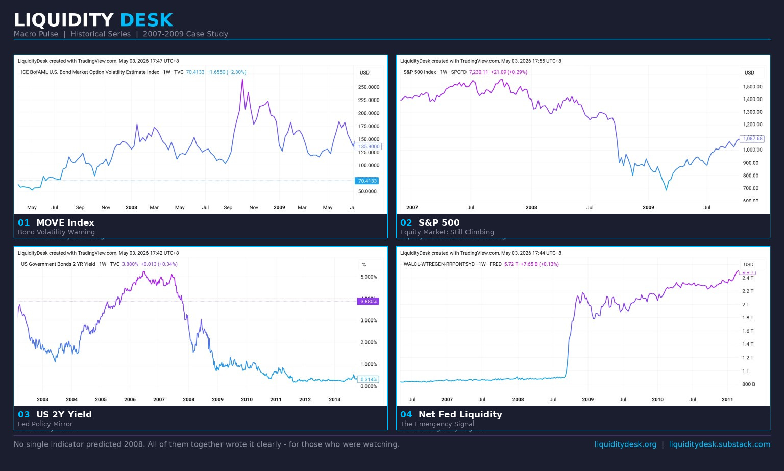
Let us walk through 2007-2008 indicator by indicator, not because 2008 will repeat in the same way, but because the mechanism is universal.
Signal 1: The Yield Curve Inverts (2006)
The yield curve is the difference between long-term and short-term interest rates on US government bonds. In a normal world, long-term rates are higher, logical, because you are lending money for longer and want more compensation for the risk. When short-term rates exceed long-term rates, the curve “inverts.”
It is important to understand why this happens, and here, the conventional explanation is incomplete. The Fed controls only the short end of the curve directly: the federal funds rate. The long end, 10-year bonds, is set by market forces: inflation expectations, global demand, growth prospects. The Fed cannot command it.
When the Fed aggressively raises short-term rates, the US 2-year yield rises mechanically. If the long end does not follow to the same degree, the curve inverts, not because the market “predicts a recession,” but because the Fed pushed one end up mechanically. The recession signal comes indirectly: with an inverted curve, banks borrow short at higher cost and lend long at lower rates. Their margin disappears. Credit tightens. The real economy feels the credit shortage with a 12-18 month lag.
In 2006, the T10Y2Y, the spread between 10-year and 2-year US bonds, went negative. At the time, the S&P 500 continued to climb. The inversion was dismissed with the argument “this time is different.”
It never is.
5%, The Historical Ceiling
History shows that in the post-2000, highly leveraged version of the US economy, the 5% area has repeatedly acted less like a normal policy rate and more like a stress threshold. In 2000, the Federal Funds Rate reached 6.5%, the dot-com bubble burst, the Nasdaq lost 78%. In 2007, the US 2-year yield hit 5.2%, Lehman followed 14 months later. In 2022-2023, the Fed again reached 5.25-5.50%, but this time cut rates in a controlled and timely manner, without a systemic collapse. The level is similar in all three cases. The difference lies in the hidden leverage beneath the surface, and whether the other indicators were confirming simultaneously.
Signal 2: The MOVE Index Starts Rising (Mid-2007)
The MOVE Index is the “VIX of the bond market.” While the VIX measures expected volatility in equities, MOVE does the same for US Treasury bonds. When MOVE rises, institutional players are buying protection on bond positions. They do not do this without reason, and they typically know more than the media.
The normal level of MOVE is below 100. When it breaks 100 and stays there, not a temporary spike up and return, but a sustained hold, the system is in chronic stress mode, not temporary volatility.
Mid-2007: MOVE breaks 100 and does not return until March 2010, more than two and a half years above the threshold, through the entire collapse, Lehman, and the beginning of the recovery. The 100 level is not an arbitrary number. The critical observation is precisely there: after Bear Stearns (March 2008), MOVE corrected downward, the S&P stabilized, the media talked about a bottom. But MOVE did not fall below 100. It stayed in the 100-175 range until Lehman. The equity market was optimistic. The bond market did not believe it for a single second.
At the time, the S&P 500 was near its all-time high of October 2007. Equities and bond market volatility were speaking two completely different languages. One of them was lying. We know which.
Signal 3: The HYG/LQD Ratio Starts Breaking (Mid-2007)
A brief explanation of the terms is needed here.
HYG is an ETF tracking “high yield” bonds, debt from companies with lower credit ratings, higher risk, but also higher interest. LQD tracks “investment grade” bonds, debt from solid, financially stable companies. The HYG/LQD ratio is the thermometer of risk appetite in the system. When it rises, investors are buying risky debt, everyone is optimistic. When it falls, they are fleeing to safety.
From 2006 to mid-2007, HYG/LQD was around 0.92-1.00. Risk appetite was at record levels, and that itself is a yellow warning light. When everyone is optimistic and no one sees risk, the system is at its most vulnerable. Then the ratio started to waver. Small drops, small recoveries. Something in the credit market sensed that the real economy was already feeling the weight of high interest rates.
Why does the credit market sense it first? High yield bonds are issued by companies with thinner margins, less buffer, precisely those that the real stress hits first. HYG/LQD does not track Wall Street. It tracks Main Street.
Why the Real Economy Breaks First
When the Fed raises rates, the effect is not immediate. Fixed-rate mortgages continue to be serviced under the old conditions. Corporate bonds maturing in 3-5 years are not refinanced right away. Consumer credit builds gradually. The entire transmission mechanism of monetary policy works with a 12-18 month lag.
That is why the market looks fine while interest rates are already breaking things. New mortgages are expensive. Small businesses with floating rates are already paying more. Construction stops. But the S&P 500, tracking primarily large corporations with access to capital markets, still reports solid quarterly results. This is the window of illusion, and it can last months.
Signal 4: The Fed Cuts Rates in Panic (Late 2007)
The US 2-year yield is the direct mirror of monetary policy, it follows short-term rates almost mechanically. Late 2007: the US 2-year yield falls from ~4.8% to ~2.4% in a matter of months. Vertically. The Fed is cutting aggressively, an admission that it has broken something in the real economy.
At the same time, the yield curve de-inverts sharply. Many commentators interpret this as a positive sign: “The curve is normalizing!” But de-inversion after a prolonged inversion historically coincides with the onset of recession, not its avoidance. The curve de-inverts because the Fed is slashing the short end in panic, and the Fed only does this when it is truly worried. It is not a signal for relief. It is a signal that it is already too late.
The Signals Together: What They Say
By spring 2008, the picture is as follows: the yield curve has inverted and de-inverted, MOVE has been above 100 for months and cannot come down, the HYG/LQD ratio is falling, the US 2-year yield has been cut in half, and Bear Stearns was sold in an emergency to JP Morgan on March 16, 2008 with federal backing.
Each of these signals on its own can be explained, rationalized, ignored. But all of them together, simultaneously, in this sequence, they tell only one story.
Six months later, on September 15, 2008, Lehman Brothers files for bankruptcy. MOVE explodes to 265. The S&P 500 loses 50% of its value.
The Fed Misleads Markets, And Signals Work Both Ways
There is something rarely discussed openly: while the Fed was aggressively raising rates in 2004-2007, broader financial conditions and private credit creation remained loose enough for risk assets to keep climbing. Money kept flowing. Equities rose, risk appetite climbed to record highs, HYG/LQD reached peaks. The Fed was effectively sending two contradictory signals simultaneously: rates said “be careful,” financial conditions still said “buy.” The market chose what it wanted to hear.
The real economy has no such choice. It pays the interest rates. And when the breakdown comes, quietly, gradually, with a 12-18 month lag, the Fed is already too deep in the trap. The only way out is to fire liquidity vertically. That is exactly what happens after Lehman: Net Fed Liquidity jumps from $900 billion to over $2 trillion in a matter of months. The Fed invents modern quantitative easing not as planned policy, but as an emergency measure.
But for those who had been watching all the indicators simultaneously, the moment was no surprise. And for those who were watching, here the reverse signal follows. The vertical liquidity is the first flash: the Fed has turned on the printing press at full throttle. Then the ratio, HYG/LQD, begins to normalize toward mid-2009, risk appetite returns quietly, before the news is good. And finally the confirmation: MOVE falls below 100 in March 2010, the system officially exits chronic stress mode. Three signals, in sequence, each confirming the previous one. The signal was crystal clear: buy. Not because the news is good. But because the system is normalizing, and history shows only one outcome from this situation.
The signals work both ways. The same system that warned of the crash announced the bottom. The question is whether you were watching.
And Today?
The goal of this article is not to predict catastrophe. The goal is different.
Today, MOVE is at 70.41, clearly below the 100 threshold, after a brief spike above 100 earlier in 2026 that quickly faded. What matters is how it got there: a sharp spike up and immediately back down, not a sustained hold, not chronic stress. Structurally different from 2007. HYG/LQD is at 0.7372, at historical average levels. The yield curve is positive at around 0.51.
Taken individually, the picture looks stable. But the right question is not “does everything look fine today?” The right question is: are you watching all the indicators simultaneously, or just equities?
Because in September 2007, equities also looked fine.
Why Macro Pulse Exists
I started writing the Macro Pulse series because all signals matter, those in the real economy, liquidity, and credit spreads alike. Although I try to cover everything in the monthly analyses, the information is quite extensive and something always gets missed. And it is worth watching everything, not because any single indicator is a magic number, but because only together do they give a real picture.
No single indicator predicted 2008 alone. All of them together wrote it clearly, for those who were watching.